Saturday, February 27, 2010

Obama FDR for The Weekly Standard


This past week I did another one - day - turnaround Obama for The Weekly Standard. What can I say? The Weekly Standard is by far my best client, they are great to work with, I've done over 35 paintings for them . . . that's nothing compared to the piles and piles of paintings my friend Tom Fluharty has done for them, but I still get excited and look forward to every time I get to work with them. I always try to give my all no matter what the time crunch is.

Almost every time I work with the Standard, the deadline is super quick. It doesn't matter if it's a cover or a spot illustration. I don't know if I've ever had more than two, maybe three days to turn something around for them. I learn a great deal about myself while working on these jobs, and I learn a great deal about what not to do the next time around. Still, it's important to me that the art is good and that it does it's job. It must tell the story that the art director and editor are after, and it must also meet my standards.

This job was no different. The final art that is posted above was all in a days work. I'll explain more below.


This is how the final art will appear in the magazine. The open space above is for the title and text for the article. I liked the painterly look on the edges of the background . . . turned out like this mainly because I was in such a rush.


This was the first sketch I did after getting off the phone with the art director on Wednesday night. About a five minute sketch. It was already time for me to go home for the day, so I would start fresh in the morning. I would have all day Thursday and Friday to complete the illustration.


I wasn't 100% sure what the a.d. wanted, if it was a parody of Obama in the exact pose as FDR or if I should take it to another place. The article hadn't yet been handed in. So until I heard back on what exactly I was going to be drawing, I did this sketch and sent it to the a.d. to get a reaction on whether this was in fact the direction he wanted to go? This sketch was done in about 20 minutes or so.


At this point I had already begun to block in Obama's face, trying to give my self a head start. The a.d. and I talked about different ways to tell the story, and in the end, this sketch just wasn't doing it for either of us, so . . . .


. . . it was time to start again. The a.d. thought it would be funny to show Obama swimming in FDR's clothing . . . everything is too big for him, so I did this new sketch and sent it off as quick as I could to get the OK to move on and take it to the finish. This was near the end of the day, as I do not work nights unless I have to. The sketch was approved.


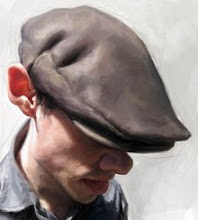
I then spent my last bit of the day painting his face. I wanted to get it to a point where I would feel settled enough to go home for the day, knowing that I had to finish everything the following day.


Late Thursday night after my kids were in bed, I decided to go back into the studio for a couple hours. Something about the face was really bothering me, it wasn't capturing the likeness or humor that I wanted or that the piece needed. So I found some new references and began sketching . . . and this was the version I settled with. It was now to a point where I could go to sleep and feel good about the work I had done that day.

I was in my studio again around 5:00 a.m. Now that the sketch was how I wanted it, I had until 5:00 p.m. to complete the entire painting. It was a long and brutal day, and for the next 12 hours, I painted non-stop. I took about a 20 minute lunch break somewhere in the midst of my painting frenzy!

All in all, I'm happy with the way the painting turned out, learned a lot and even though it was tough, I had a blast . . . I love my job!

Thursday, February 25, 2010

Blue Hellboy


Here's a drawing I did as a commission for a very patient person . . . I know, I know . . . "Hellboy" is supposed to be red. I don't care, I love drawing with blue pencil, I enjoy the look and feel of it. I also added a bit of .5 mm HB lead in there for some darks . . . a fun little drawing.

I'm currently working on another Obama for The Weekly Standard, a day and a half turnaround. I'll share it here on Monday!
-Chow

Wednesday, February 24, 2010

Peter de Seve made me do it . . .


I LOVE PETER DE SEVE!

I recently bought Peter's book "A Sketchy Past". If you don't have it, WHAT ARE YOU WAITING FOR? Peter's work is so inspiring, that after flipping through only a few pages I have to put the book away to get my sketch on . . . I had some time today to look through the book . . . I was able to look at the book for about five minutes before I couldn't take it anymore . . . and did this quick sketch of a man on a bench.

Tuesday, February 23, 2010

Make a Remark


This is my painting for Gallery Nucleus's Curiouser and Curiouser show opening this Saturday. Follow this link to learn more about the show.
www.gallerynucleus.com/gallery/exhibition/223

When asked to do a piece for this show, I knew right away that I wanted to paint the Red Queen, but my way. I wanted to paint an image that didn't automatically make you think of Alice in Wonderland, something that would just be a cool painting. I had a plan in mind before starting this painting, an idea of what I wanted to do and where I wanted to take it, unfortunately it didn't quite happen as I had wanted, and I'll explain why.

I originally wanted to paint in oils, but I knew that I would be cutting it close with the deadline. So, I decided to paint with acrylics. The surface is 16"x 20" birch that I sanded, gessoed, sanded again, gessoed once more and then finished with one more sanding. I decided I would use Golden Open's which I have messed around with before on other surfaces and quite enjoyed. However while painting this painting, I went through it . . . it was a struggle and fight every bit of the way . . . I was reminded of the frustrations of painting and what it was like when I was first learning how to paint. I'm not sure what the problem was? Was it the Golden Acrylics? Was there something else wrong?

When I paint with acrylics, I build thin layers of paint on top of one another, no real details, just blocking in . . . once I'm happy with the way it's coming along, I get out the small brushes and finish with the details. I did that with this painting and it seemed fine. It was when I began detailing that the problems started, and it was too late to start over.

When painting with acrylics, you must know that the color and value you place down will dry darker than the color you first put down, that is a given. And like I said, I have used the Golden Open's on other surfaces and they seemed to have worked great? For some reason, while painting this painting, the paint would dry WAY DARKER than what I mixed and put down . . . to get the highlights on the top of her hand for example took layer after layer after layer. At one point I even experimented and put pure white down to see what would happen and that too dried as a light grey. Another strange thing happened. At one point, I dipped my brush in water to clean off a bit of paint, and it was as if I took some turpentine to an oil painting, the water lifted the layers of paint beneath . . . talk about frustrations . . . !

So, by the end of the painting, I had painted the face three times and the main hand three or four times, it took days to do a painting that normally should have taken me two days, three days tops.

I decided to compensate for what was happening, and understanding that my time was dwindling away, I decided to go half detail and half painterly with this painting, finishing with some palette knife painting, so I focused my detail where I want people to look and was loose and more expressive in other areas.

I rather enjoy the final look of the painting and the struggle I went through to finish was odd, but also a memory that I will cherish as it tested my character as well as my patients. I hope if in the L.A. area you will have time to see the show so you can see the painting in person.


Here's another photo taken of the painting. Seems like every picture taken captured something different? There are bits in this photo that are more accurate, and bits in the one on top that look close . . . hopefully together, these two pictures will give you an idea of how the original looks?

Monday, February 22, 2010

A quick Tweedle Warm Up Sketch . . .


Quick warm up sketch that I did this morning, about 25 minutes . . . I've been so busy with bigger projects and haven't had much time for sketching and doodling, which I think are SO IMPORTANT to do even when you're busy. Not always easy to find the time though. The sketch above isn't for anyone or anything, I'm just excited about the show this Saturday and about the film FINALLY coming out, so I felt like doing an "Alice themed" sketch . . . so this is one of the Tweedles, not sure which one . . .
Anyways, as the previous post states, I am in a show this Saturday at Gallery Nucleus. An Alice in Wonderland show . . . as you may know, I did some character design work for the film. I worked with Bobby Chiu and Kei who did most of the character design work . . . it was great to work with them, was a nice change for me. The show this Saturday at Gallery Nucleus will showcase the work of the artists who worked on the film . . . we were asked to do something original, something that we didn't come up with or draw for the film, so I did my own version of the Red Queen which I will share here very soon.

www.gallerynucleus.com/gallery/exhibition/223

Sunday, February 21, 2010

Curiouser and Curiouser at Gallery Nucleus


I want to invite you to a group gallery showing I am part of this coming Saturday in L.A. The theme was Alice in Wonderland and there is going to be lots great art and cool Alice stuff to look at. I painted a 16 x 20 acrylic painting of the Red Queen, a painting I am calling "Make a Remark". I'll share the painting here soon!
www.gallerynucleus.com/gallery/exhibition/223

Saturday, February 13, 2010

Society of Illustrators show!


Last Friday at the Society of Illustrators show in New York. It was awesome! I spent the night hanging out with my good friends Fred Harper and Hermann Mejia! I also met and hung out with Steve Brodner, Victor Juhasz, and Peter de Seve . . . What a night!

Tuesday, February 09, 2010

Cover for Exaggerated Features


This year at the ISCA annual convention Glenn Ferguson won the GOLD nosey!

It's tradition in the ISCA that the Gold Nosey winner from the year before, has the honor, and privilege to paint the next Gold Nosey winner. As you know, I won the Gold last year, so it was my pleasure to paint this cover.

The past convention covers of Exaggerated Features were all great, and done well, but I wanted to take it to another level. I thought it would be more fun to honor the Gold Nosey winner by roasting him, or her. This is a great opportunity to be funny, or to "make fun of" . . . like a celebrity roast. After all it is for a caricature organization. My goal was to have some fun with Glenn and JoAnn, in a "brutal yet loving" way . . . I also wanted to give the members of the ISCA something that they would cherish and enjoy, a gift if you will . . . my hope is that they bust a gut laughing when they receive their copy of the magazine.

What makes doing this cover so much fun is knowing that the people getting the magazine all know Glenn and JoAnn. They all know that Glenn worked hard to win that gold nosey, and in the process, he's won 2 silver nosey's and 3 bronze nosey's! Congrats Glenn!

The idea behind the painting:

For those of us who were there and know Glenn, we know that he did in fact, win the Nosey, but that doesn't necessarily mean he gets to have it. No, for time alone with his Nosey, Glenn must perform tricks of sorts and win the approval of his beloved JoAnn. If she is entertained, she may humor the idea of letting him look at his gold nosey!

George Lucas Poster on CNN.com and Wired.com

Monday, February 08, 2010

Sketches, doodles, and thumbs for The People VS George Lucas


Before the final idea was approved, I did many sketches, doodles and thumbnails. And because I was under such a tight deadline, these drawings were not all beautiful to look at, most were scratches, and ideas that had to be put down quickly. The director and crew at Exhibit A Pictures had ideas of what they wanted but didn't quite know the direction they wanted to go? We went through many variations of how George could look, how he should or shouldn't look, how the fans should or shouldn't look . . . the idea for the poster changed several times. At one point there was going to be a large crowd on each side of George. A hating side and a loving side. Keep in mind, the poster size is 27"x40" and I only had a week and a half from start to finish . . . so, in short, the idea for the poster bounced back and forth between the director, me, the producers and so forth until finally settling on the final idea. It's an exciting ride and it helps that the folks at Exhibit A Pictures were great to work with, and very nice people.


This was one of their first ideas. To speed up the process, I painted his head and then photoshopped random picture references for the hands and background. If this idea survived, I would have re-drawn everything shot my own references and from there, painted.


I really liked this sketch. George doesn't care what the critics say, loving fans or hating, he's George Lucas, he can do what he wants.


This was one of many sketches having to do with hands pointing at George . . . the ideas for the poster at this stage were all over the place and I was feeling a bit nervous . . . my time was diminishing drawing all these hands took quite a bit of time, painting them all would have been a crazy amount of work, but if developed and pushed a bit more the idea could have been interesting. In the end, we all decided to move on to other options.


I thought this was a fun idea, two fans fighting with light sabers over George's head. Again, please keep in mind these sketches are doodles, drawn in a matter of minutes to give the director something visual to look at. We went back and forth with this idea and had variations of this idea . . . but in the end they didn't want the fans to be fighting each other, so we moved on.


Quick sketch of my friend Nathan, as the loving fan!


Sketches of my friend Josh as the upset hating fan.

Thursday, February 04, 2010

The People VS George Lucas World Premiere @ SXSW!!


www.peoplevsgeorge.com
It's been a while since I've had any time to post any new work, most of what I've been doing lately cannot be shared on line for quite some time. I can finally share my most recent project, the official movie poster for "The People VS George Lucas". A lot of work went into this piece. I don't want to go on too much right now, but I do want to thank my pal Otto for shooting great reference pics for me and of course my models, Nathan Cameron, Josh Helle and my father-in-law Vic Williams, who sort of looks like George Lucas. And last but not least my wife and kids for putting up with all the late nights and long hours! I should also say that my friend Thor did the layout and design of the poster, and I think he did an excellent job!


THE PEOPLE vs. GEORGE LUCAS will finally world premiere, fresh off the editing press, at the prestigious South by Southwest (SXSW) Film Festival in Austin, Texas (March 12th to March 21st 2010)! They included the film in their prestigious Spotlight Premiere section, alongside the latest releases from Steven Soderbergh, Michel Gondry, Jean-Pierre Jeunet and Shane
Meadows!


Click here to watch the 2nd Teaser Trailer.


GROUNDBREAKING FEATURE DOCUMENTARY “THE PEOPLE vs. GEORGE LUCAS” IN SESSION AT SXSW FILM FESTIVAL

DENVER, CO-February 4, 2010-THE PEOPLE vs. GEORGE LUCAS has been selected for the prestigious Spotlight Premiere section at the South By Southwest (SXSW) Film Festival in Austin, Texas, which runs from March 12th to 21st 2010.

“The team is ecstatic to be screening at SXSW for the film’s world premiere,” says Director Alexandre O. Philippe, “it’s the ideal platform for our launch, as the festival brings together indie films, music and interactive in a unique way that very much reflects the participatory nature of our doc.”

THE PEOPLE vs. GEORGE LUCAS explores the titanic struggle between a Godlike filmmaker and his legions of fans over the most popular franchise in movie history. “At its core, PvsG is the examination of a high-profile, dysfunctional love story”, says Philippe. “George created this humongous and intricate sandbox for us to play in; but is he the sole owner of it, or does it now belong to the ages? And what happens to your role as a creator when your audience claims it owns your art? We basically looked at the conflicted dynamic between George and his fans from a cultural perspective, and asked ourselves those questions.”

The documentary features key testimonies from the likes of Gary Kurtz (Producer of AMERICAN GRAFITTI, STAR WARS and THE EMPIRE STRIKES BACK), Neil Gaiman (THE SANDMAN, AMERICAN GODS), Dave Prowse (aka Darth Vader), Anthony Waye (Executive Producer of the BOND franchise), and Dale Pollock (George Lucas’s Biographer, Author of SKYWALKING).

THE PEOPLE vs. GEORGE LUCAS inventively combines these exclusive interviews with fan footage from around the globe, and impassioned testimonies from George’s staunchest fans and foes. “Making this film was a huge investigative challenge, considering how many people were afraid to talk to us. George is a very powerful man. But we stuck to our guns and dug deep to deliver a completely uncensored, no-holds-barred factual account, and, ultimately, what we hope will be recognized as a loving tribute,” says DoP Robert Muratore.

“The obstacles we faced made us really think about the rapidly changing filmmaking landscape, and so we used digital technology to facilitate an open call for contributions - allowing us to make a fully participatory documentary”, says Producer Anna Higgs, known for cross-platform work in the UK and Europe. “In many ways, it’s a tribute to the YouTube generation, which Lucas’s advances in technology helped create,” points out Producer Kerry Roy; “fundamentally, it’s about how new media interacts with old media, as well as ownership and copyright in the digital age; and it was our intent from day one to give the fans a prevailing voice in the doc.”

The crew worked relentlessly for two and a half years to produce the most accurate, thorough, and impartial deconstruction of an entire generation’s love-hate for the man (admittedly) responsible for their childhood’s mythos; and they acknowledge that this project wouldn’t have been possible without the extraordinary support and encouragement from the fans and contributing filmmakers. “63,686 frequent flier miles, 634 hours of footage, 14TB of drive space, 126 interviews, 719 fan submissions, thousands of fan emails, and only three death threats. The positives outweigh the negatives, I suppose,” jests Producer Vanessa Philippe.

“We were driven by our own admiration for George, profound love of his films, obsession for their significance in popular culture, and opinions about their legacy as cultural milestones,” says Alexandre Philippe.
www.peoplevsgeorge.com

Wednesday, February 03, 2010

Why the lack of posts?


Sorry for the lack of posts lately. I've been very busy with several projects. Recently finished a book cover for Penguin Group, and my first movie poster painted for the upcoming film "The People vs. George Lucas" directed by Alexander Phillippe. I'll have more to share on that very soon. This past December I painted the cover for Exaggerated Features, a "roast" of sorts for this years Golden Nosey winner Glenn Ferguson. I technically could post the art, share it here on my blog, but I'm waiting for Glenn to get his copy of the magazine in the mail . . . I don't want to spoil his surprise. So to hold you over until I can post the full artwork, here's a tease, cropped bit of the painting.
All artwork © JasonSeiler 2006 unless otherwise stated. All characters are copyright to their respective owners