Monday, March 05, 2007
About Me

- Name: SEILER
- Location: Chicago, Illinois, United States
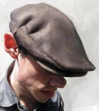
SEILER (Syler) is an award winning artist (who cares?), specializing in portraits, character design, and humorous illustration. Some of his clients include Rolling Stone, TIME magazine, The New York Times, The Wall Street Journal, Penguin Group, GOLF magazine, Guitar Player, The Weekly Standard, Business Week, MAD magazine and the Village Voice, among many others. SEILER also teaches drawing and painting high end caricature illustration at Schoolism.com When not drawing or painting, SEILER spends the rest of his time with his two gorgeous girls, Isabeau and Ava!


9 Comments:
I wonder what their critique sounded like??
..and if they're prepared to spill their critique on me aswell!!
...'COZ THIS IS AWESOME!!
..again...
whew, that is awesome....
Those warm flesh colors really make it
come alive. Nice.
Jason, excellent stuff!!!
Dude, I'm in awe with this one! I'm at work right now, and called one of my friends over to see it.
You've got something in the fleshtones here that just is ALIVE!
Well, working overtop of the great expression and composition too.
Very cool indeed! I've been checking in on your blog for a couple of months now and I have been interested to get some insight into how you approach your painting. Is there any chance you might give an explanation at some point on this blog.
I'm not a painter by a long shot so I'm always curious to see how people go about thier craft.
Jason your work just blows me away! I have no idea how you do stuff like this - but I'm glad you do! Thanks for sharing a bit of the process. Top stuff!
this is a lot better than I thought.. Awesome!!..
Thank you everyone! This was a lot of fun for me to do, I really wanted to do the best Bush that I could . . . I've painted him before and it just gets better and better . . . my first few attempts were years ago, and let me just say that I'm quite embarrassed of what I did back then.
As far as my technique and how I do a painting digitally . . .
It is really nothing special. Sometimes I use layers, but not much and if I do I flatten them soon after, other than that, I just paint. I just put color where I think it should go, and after I have a strong foundation of color, I go over everything with detail. I don't work on one area at a time, I work on the whole piece all at once so I can see it come together.
Basically it's much like how I would paint with anything else, only difference is that it's digital and I can work faster.
Post a Comment
<< Home