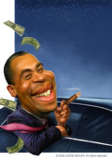
Deval Patrick


Deval Patrick, for The Weekly Standard. Got a call to do this job late yesterday afternoon. Worked a bit last night, final due today . . . all in all took me about 12 hours to complete. This quick of a turn around pushes me in many areas, definitely a challenge woth the while.
Labels: digital painting, political caricature, The Weekly Standard


23 Comments:
Nice piece, you’re great at handling your colors for your caricatures. I’m kind of stumbling in that area. I was wondering when your doing work for clients such as “The Weekly Standard,” do they provide you with pictures or do you do a little research on the internet for your subject?
Thanks Flydesign . . . . I usually do my own research, but sometimes the magazines provide reference, depends I guess.
nice jason very nice! he almost looks like me! lol. i was wondering When you start a digital painting do you begin dark and keep lightening or light and keep darkening? But this is very nice especially for 12 hours
Brilliant work as always Jason - I love the texture and rendering of his skin!
Great stuff!! Tell me, dose the weekly standard give you photo reference/pictures to work from or do you have to go find it yourself? If you do, where do you look for something with such a quick turn around?
Thanks for sharing, Jason. I really appreciate the time you take to not only post your work for others to enjoy and learn from, but to also answer questions and comments. I wonder, when you have to turn out work in such sort order, are you given a lot of direction on the context they want the subject in, or are you left to your on devices? It would seem to me that it might take a good deal of time just to come up with a strong idea and composition. Given such a short turn around I would think the sooner you have the idea worked out, the better.
Thanks again, Jason--Awesome work as always!
Again, great job!
Thank you Sensei, I do start darker in value and tone and then pull light out of it, much faster that way, light and highlights are last.
Thank you Rowan and "Mr Anonymous" Sometimes they (art directors) provide photo reference, other times I have to find it on my own, this time I had to find reference on my own. I prefer to have at least three or four photos of someone especially someone that I'm not familiar with . . .
Thank you Lash. As for your question, most the work I do for the Weekly Standard already has a set idea in play, sometimes I'll come with an idea or am asked to come up with an idea . . . . it's different for every magazine. For Business Week, they had no ideas but knew what they didn't want, I had a short time to work and had to come up with an idea that they finally settled with . . . the Art Director for the Weekly Standard is one of the best I've ever worked with, he's easy to work with and has great ideas and input. Not always the case.
Awesome! You can really turn around an amazing piece in such a short time. An art director's dream come true!! HAHA!! Thanks for your kind comments as well!
You're the master, man. By the way, could you do an illustration for me with 20 people playing different sports? I'd like to have it in about 45 minutes. Thanks.
Jason I don't know if it's my video or what but I'm seeing some greenish nuance in the skin tones. That's one thing I like of those who paint dark complected faces.. the use of cools like green and/or blue to add lustre to the skin or hair. Just another example here of your ability to capture and produce impressive portraiture.
Thank you much Marco and Shawn! And sure, I'll give it a go Marco, sounds like a challenge! :)
Wow Bill, you've got a great eye! Yeah, I like to use blues and greens a lot in skin tones, a lot of fun noticing those things. And in caricature, I not only exaggerate the features, but the colors as well.
Simply wonderful, you have an amazing talent, congrats for your work
Hey Jason - really nice man!!
really like the colors in this one - really nice and saturated
Good grief man, you gotta slow down. Too much good stuff!
Thanks Simon, Alberto and Ryan! . . . and Ryan, what do you mean slow down? I gotta catch up with you brotha . . . I think I'll be posting a digital painting video soon!
This looks AWESOME!
totally cool. I love that your paintings look like you took the actual person and just started stretching them around until they turn into a cartoon. love em.
Very nice. Beautiful skin.
Thank you Bobby, Nathan and Wouter! Wouter, I started a sketch of you! :)
thanks for information
Agen Qnc Jelly Gamat Di Way Kanan
obat ayan
qnc jelly gamat perbotol
agen bandar lampung
obat walatra G-Sea Jelly Gamat Emas
Cara Order Jelly Gamat Rasa Jeruk G-Sea Walatra
obat walatra kapsul
agen jelly gamat di karimun
keuntungan menjadi agen qnc jelly gamat
Post a Comment
<< Home