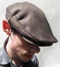
Final and then some . . . .


Here's the final art for The Weekly Standard. This was a challange more than normal. I had about two days from start to finish. I was near finishing with only a few more things left to paint. His left arm and airplane as well as final touch ups on the skin and hair. My phone rings with the news that we have to change the illustration or lose it to a photo . . . arrrrrrgh! Can happen and does happen . . . comes with the job. Splash water on your face and move on. So with less then half the time left, I had to change my illustration to what you see on top. I'm a bit bummed, because I really enjoy the first version with him sitting much better and the new version was rushed!
Still, I look forward to every challenge, and I truly enjoy working for Philip at the Standard, he's a great Art Director. More importantly, he's a great guy who is pleasant to work with . . . there are some a.d.'s out there who aren't nearly as workable, or understand what it takes to create this kind of work.


15 Comments:
Jason quite the adventure story. Being in business for yourself takes guts and no fear of cold water in the face or disappointment. The end result is fascinating... and your original concept with the guy on the floor playing "airplane" pretty damn good.
Still looks good to me Jason. I don't know who this is, but he looks cross-eyed here. Is that his usual look?
Funny how the process is so different for each job. It would be boring otherwise!
eeewww...hehe...
Outstanding anyway Jason...
Happens to the best of us my friend. Not to worry though, it turned out great!
That's a shame. Your first version makes him look more child-like. I wonder what they were thinking?
Of course it was the best option.. it is really frustrating when people who don't know about illustration destroy your work pretending they know something.. stunning work as always!..
egads....!!!!
You worked it out, the blue thing...and hadn't heard from you. Looks good too...
...we see the difficulties of wanting to do this for a living, and yes...can be very frustrating.
Like the "splash water" thing...and when all is said and done, you did good!
This is the stuff of making one's skin thick, and that thing I often say that we artists learn "to wear brass underwear!"
daaaahd
dude, you still tore it up though, man! great job!
Awesome! I do prefer the composition with him sitting - I can't believe they'd use a photo instead!!! The final is beautifully painted - I love the hands :)
turned out great!
realy good sketch' !!
Thank you so much everyone!!!!! Moyse, he wasn't cross-eyed, I just did that for humor sake . . .
you are one of the best....the beast...i don't know...;o)
I enjoy your stuff so much and sometimes I practice painting your images, use it as a guide, for fun. Are you ever going to offer a class on just painting? I would be very interested in it, your tips, experiences and your process.
I'm always interested on other peoples process. Everyones different.
I like the undone shoelace and the whatever he stepped in stuck to his shoe. pity they didn't use that picture. you obviously went to a lot of effort to make him look child like. if you'd had the time, what would you have done differently to the final picture? It's not as funny but it looks just as awesome.
Post a Comment
<< Home