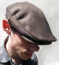
Eric Affeldt for Dallas CEO Magazine

Hey everyone! Click here to see the new "updated" Imaginism Studios website. Click on "our artists" to see the portfolios of Bobby Chiu, Kei Acedera, Stephen Silver, and myself! There's also other cool things to check out on the site so what are you waiting for!?!
I finished my painting for GOLF magazine and will be posting it here along with sketches and prep for the job, as soon as I have permission to do so. For now, this is a 1/4 page spot illustration that I did a couple weeks back for Dallas CEO Magazine. Technically they gave me a week to finish this job, but because of other work and taking the the pay as well as size of the piece into consideration, I did the entire job in a day.
The subject is Eric Affeldt. I don't know anything about this guy, I was told that Dallas CEO was a business magazine and this spot illustration will be place next to a "business quote". It would be a silhouetted illustration which means a white background behind the subject. They wanted his whole body and they said I should put him in a relaxed pose.
I knew that because it was a business magazine that they wouldn't go for a lot of exaggeration, so I decided to focus on adding subtle exaggeration and humor to his likeness. Because it was going to print so small, I decided to keep my color simple as well as the style of painting. I kept it loose, more direct to the point. Also to fit his entire body in the size that I was given, I decided I would do a perspective shot of him, this way his head will print large enough to see while still showing his entire body. It's funny for me to see how it turned out, because It ended up looking very similar to something "Ismael Roldan" would do. I don't mind, Ismael is a good friend of mine and does great work, whenever I have done a perspective like this in my caricature work, I can't help but think of Ismael, he's the King of Caricature in perspective.

This was the likeness sketch I sent to the a.d. once the likeness is approved, I start the final painting.


9 Comments:
Great job Jason.
nice one. how did you achieve those textures? really gives a great traditional feel.
Goodness Jason, this is gorgeous. The textures and shapes are organized in a very simple, pleasing way.
Great painting Jason! The sketches you provided before the final are superb! the texture you have on the beginning color rough, the paints look real as if you were painting on canvas!!! was the whole piece digital?? either way love it man!! Keep up the great work!!!!
It's very funny. The mouth is hilarious it's good work. I saw your Tim Burton video on youtube a few months ago but it's not avalaible anymore. That video was great.I miss it, why did you take it of?
you have taken caricature to a new level, leaving us beginners with a lot to learn, I agree Ismael is the King of perspective, when I saw it I immediately thought of him, however you nailed this one!! Wish I could afford your classes!
congrats
Wonderfull work Man. I add your blog as my favorite in my page.
Best
Ique
Kick'n butt Jason style! I never get tired of your portrait work. Many lessons in each post - your schoolism students are lucky to sign on with a pro... Keep delivering the goods --
Hello Jason.
Nice work ...
The textures you see in each piece are excellent ...
I always get a little inspiration in your blog ...
Congratulations!
Post a Comment
<< Home