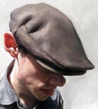
Elvis Costello

With this painting my goal was to paint loose, blocking in with shape and color. To some viewers of this blog "hyper-realism" is impressive, but to me it can be lifeless and boring, and it's not as challenging to me as brushy painting seems to be. To quote my friend Jan Op De Beeck . . . "You can train a monkey to render".
I'm more interested in creating art and I prefer paintings that hold life within the brushwork. I love that through the mess of brush strokes and overlapping color, an image can appear . . . that's why I paint, to understand and experience more.
On another note, I'm happy to announce that my painting of George Lucas was accepted in Comminication Arts Annual 2009!


31 Comments:
I completely agree with you Jason! A painting that is overly rendered or just blended to perfection in every area does become lifeless, has no soul. I love paintings that you can feel the strokes and the intensity of it. Your Elvis Costello painting is Superb, you have demonstrated exactly what a painting should portray. Congratulations again for such a great painting!!!!
The light, the likeness, the expression, FANTASTIC, WONDERFUL!!. A master piece!!!
congratulations... and it's true make beauty image with free brushstrokes it's more funny and amazing...
sorry for my english...
Utterly brilliant. It's today's Elvis with yesterday's bitterness.
Congrats on the Annual!
Hey Jason - we've not met before, but have at least one common friend in Silver. Your work is just terrific. I started following your blog about a month ago. Some guys do good caricatures, some paint well. Seems rare to find someone as yourself who does both REALLY well. I look forward to each post. Thanks!
congratulations sir!!!!every body says every thing i lost my word so well done....
YOUR PICTORICAL TECHNIQUE IS AMAZING!!!
WoW that's pretty amazing! :D haha
Brilliant, I love the light on the guitar
This comment has been removed by the author.
I agree with both of you and Jan op de beeck, difference between photograph and painting is only brush strokes.
Wow, gorgeous painting! I agree about the painterly style, that's an area I want to develop in my own work for sure.
Superb love it, captures the man perfectly and the detail of the light on the guitar is excellent!
AMAZING!!, Jason,your work keeps getting better and better, I know for an artist his best work is the next one, but I think you reached a point most of us dream of..
Congratulations, that Lucas piece will kick ass at the Communication Arts Annual 2009, Thanks for sharing!
Like this point of view...
beautifull light, attitude, excellent!
Absolutly fabulous jason ,great likeness,I like.
Terrific colors, very sophisticated, Jason!
I have been feeling the same way. Less is more :) Great painting! One of my favorites.
Congrats to you Jason on the Communication Arts Annual 2009! Also a wonderful finish on Elvis. Love the lacquer rendering on the guitar and the focus on the head/features is right where my eye ended after its romp around the picture plane.
This is beautiful Jason! I love the way you maintained the looseness throughout the piece.
Needless to say, the likeness is faultless as always!!
Flawless Jason! your one of only a handful of painters that manages to make digital look good.
This is a phenomenal piece...I always love your "painterly" work and even more so now since it seems there are so many copying your "money" style (sometimes even in the way you sign your name).
...and congratulations on "George" selected for the CA Annual, now I'll be looking forward to receiving the issue even more!!
All the best
Hi,
The tecnique is amazing, but it's the gaze (or should I say stare ?) that really empowers this work, I think.
Best regards,
José
well, it's all been said, but i totally agree with you. especially now that everyone seems to be painting digitally in the exact same way,making it difficult to distinguish different artists.
paintings should look like paintings!
and this one is top notch, I'm particularly fond of the texture in the jacket, and the softness of the reflections in the guitar.
wow!!
I tell ya, more and more monkeys wet their pants while viewing this blog...
I defy anyone to tell me standing in the presence of an actual genuine person...looking at their eyes, in their face...that peripherally they can see the hand down by the side or in this case strumming the guitar in perfect sharp definition.
What some artist need to reflect upon is that there are various modes of seeing. Look around a room, look anywhere and you can only see that which your eyes directly focus on as sharp. Everything else seen is with peripheral capabilities of the eyes, and it appears while looking at one spot blurry and undefined by comparison.
Such is the reality of actually seeing, and thus to paint REALISTICALLY...one mode would be to paint as you would see it. In this case...to look into the eyes of Elvis Costello would be to note that peripherally you would NOT see the hand sharply rendered. It is a great device in painting to manipulated the viewer's eye by what is called compare and contrast, and thus the hand does not call upon our interest. The face, the eyes..especially those glasses just pop out as a result.
This is really one of my favorite of your more recent works Jason. Love it...love it!!! It shows you are working with an artist's heart!
daaaaahd
hello i just love it!
the colors and the painting feel to it
would it be possible for you to share your custom brush?that would be awesome...
This looks GREAT!! And congratulations on the Communication Arts show!!
Amazing detail ! Rendering like a photo, but I like your caricature works, more.
My new favorite of your pieces. Excellent.
Post a Comment
<< Home