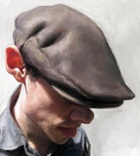
Eric Holder for The Weekly Standard!

This is a job that I did yesterday for The Weekly Standard. I'm never quite sure how I feel about these paintings? Working on these jobs is challenging on many levels, but in the end it's like giving birth to a new baby and the baby is taken from you right away, before you ever had the chance to really hold it.
I was called Thursday, did a rough sketch, it changed and developed until I had it to a point where I felt like it was OK to go to sleep. I awoke around 4:45 a.m. got to work at 5:00 a.m. and worked all day until I finished at 5:00 p.m. A long day to say the least.
It's important when working on a job like this that the sketch is strong, more and more I spend my time on the sketch and less time on the rendering. If the "story" is strong then the final will be much better even if not painted as tight as it could be.
Because there's so much to paint in so little time, I don't spend too much time in any one place. I move about as I paint. Painting a bit on his face, then to his jacket and so forth. I continue developing and building the piece as a "whole" until it's completed. With this peice, there are a few things I would have liked to work on a little more, but again for the time given, I have to make some sacrifices in my style and technique in order to make my deadline.
As I said above, I feel like these jobs are in a way, like giving away your new baby. I haven't spent anough time with the painting to evaluate it or make smart choices . . . it all happens really fast . . . once the sketch is approved, there isn't much time for anything but painting. So, I paint.
Not sure why I'm sharing this, I guess I wanted to share a bit of what it's like to do a job like this in a day? Don't get me wrong, I enjoy this work, but it is difficult sometimes to create something so fast and then send it off just as fast . . . "let me cut the cord at least"!
Typically when I have more time, I like to come back to a piece that I'm working on, step back from it and evaluate it's progress. On quicker one or two day deadlines, you just have to do what you can to produce something that illustrates what the a.d. and editor want for their magazine, and if possible something that "you" as the artist can also be proud of.
So in saying all of that . . . I'm happy with the end result of this piece, I would however have liked to refine it a bit more in certain areas.

Detail of paint work on face!


12 Comments:
Yeah, that must be pretty annoying, but you did an awesome job!!!! The most important details the face and hands, both look great!!!
It´s a great work. Sometimes I prefer something without many details, like the powerfull roughs of Craig Mullins.
It´s hard to decide when you must stop. If you have the time, of course.
It has to be great works!
nice!
I quite like the contrast between the level of rendering in the face compared to the body.
As is, i like how you just see his figure in silhouette.
it's always impressive to see such solid work done so quickly.
I totally agree on getting the sketch right. It really shows if you haven't put the work in at the sketching stage.
On a side note - I've included you in a post of my favourite art blogs if you want to take a look. :-D
http://blog.cult-of-pop.com/707/kittymeow-some-of-my-favourite-art-blogs/2009/08/01
This comment has been removed by the author.
It´s a good job, and your client must be really pleased, sure!
I once suugested to a forum that they post an article caaled " A day in the life". Just to give budding artists an idea of what's involved in a working day for a professional artist. I mean, what's the point in striving towards commercial success if you don't know what that may involve?They ignored my suggestion but it later cropped up in their magazine as an article. I think this post is a helpful insight into the decision making processes and time constraints involved when painting for a commercial client.
its good work, even if its fast. i see what you mean though about the rendering more detail, but i think your initial sketch of the body and the pose its nice potential and kinetic energy (in the knees, angle of the feet, tilt of the torso, etc) take the edge off the lack of detail, particularly in the lower body. The attention to text in is a nice focus as well, so overall the work has given a nice visual flow. The idea is quite cheesy, but I think you really gave it a sense of class and humor.
The DVD arrived, BTW. Very good (esp the sketch of your Dad.) Thanks!
what medium did you use? acrylic?
I keep hoping that someday you will wean away from the commercial stuff... and go to gallery work. The commercial work will drain you dry. It is a great bootcamp... but you can do better. You might be surprised (from a financial point of view). try it, you may like it.
Genial Master!!!!
Post a Comment
<< Home