Major League Baseball World Series!
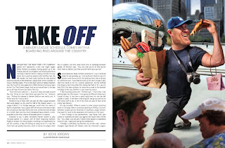
I was honored to do three paintings for the 2010 World Series Program, a full page illustration . . .
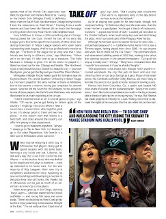
. . . and two smaller spot illustrations . . .

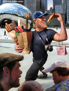
This was a fun job to do, but it had many challenges. While working on these three paintings, I also did my first painting for Rolling Stone, and on top of that I caught a nasty sinus infection. Good times, but the brush must move on!!! In the end, I only had 5 days to complete all three paintings. I decided to loosen up my style, I wanted them to be fun, and light-hearted. I decided to be more painterly as well, leaving brush strokes and some sketch lines. I wanted the paintings to feel more traditional than digital as I felt it would fit the article more.
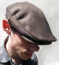
I had a difficult time finding good references of Jeff Weaver of the Dodgers . . . I wanted a specific look which I could not find. The best reference I found was taken indoors with horrible lighting and just about everything else wrong with it. So I ended up re-building his face using several different reference shots including pictures I had taken of myself. Challenges are good fun, but can be stressful under such tight turnarounds.
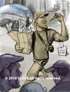
Quick mock up sketch.
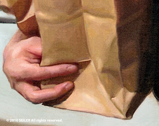
I wanted to show these close ups to share the loose and painterly look . . . less is more was the idea . . .
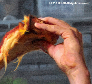
I love and hate painting hands!
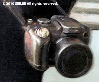
I really enjoyed painting this camera. It's simple but I really had fun with the color and brush work.
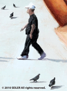
The little details in this piece were fun as well.
This lady is so simple and took maybe a couple minutes at most, but she's my favorite part.
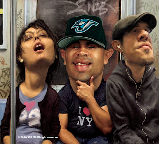
This painting was a lot of fun as well, but took almost as long to complete as the opener and this was only supposed to be a "spot illustration". Oh well, sometimes you gotta go with what you're feeling. Again, I really enjoyed creating the brushwork in this one. I wanted to capture the grimy lighting that you sometimes see in NY subways . . . and there's always someone sleeping somewhere with their mouth wide open, so I thought that would be a fun little bit to throw in there.
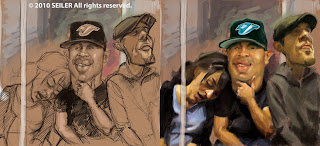
The sketch on the left was done very quickly and was the mock that I did for the art director. The version on the right side was how the block in looked before I decided to re-draw and paint the sleeping girl. I changed her because I felt in this version they looked like a couple instead of strangers and it's funnier if they don't know each other.

This was the last spot I did for the program . . . this one had to be done in one day. Again, less is more, I knew it would print rather small, so I kept it more brushy and loose.
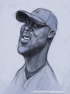
This is a sketch I did for one of the spot's but then last minute I was asked to paint someone else instead.


19 Comments:
Excellant work! Congrats. I love that image of you in the subway.
AMAZING!! Congratulations Jason:)
Great pieces man.
Very cool Jason, love the way you painted these! Cool to see your initial sketches and thought process, as always!
Great work!!!! I like the brush strokes.
Congratulations! my bro, you are the best always!
Eres el mejor, de pana, sin palabras. esta demasiado bueno las caricaturas.
Superbly done!
Loving these!
Thanks for laying these out for us fans Jason - what you can do with 4 shapes: sphere, cube, cone and cylinder is real magic.. and cheers on your addition to SI .. big stuff!
your work is wonderful, very accomplished !!!
I love your colors !!!
Just incredible - how you them paint so fast is just stunning Jason. Great stuff
thanks for sharing Jason, learning a lot from this post:) magnificent as always!
Very cool Jason. Congrats on your series for the Series.
I don't recognize the brush. How did you accomplish such an organic look? If you tell me, will you have to kil me? Great work - as usual
Great work, Jason.
Awesome work, love the Chicago bean in the background!
awesome as usual,
did you decide to place self caricature in all your multi characters work now?
Or is it just because you use self ref ;)
great. i particularly enjoy the close ups, "painterly".
It's great.
Hey, sir. Quick question: Was the last sketch done in Sketchbook Pro or on paper? Thanks.
SS
Post a Comment
<< Home