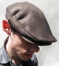
Martin for The Bloomberg Market!


This was painted and published three months ago for The Bloomberg Market, but because of certain legal agreements, I was asked to not share the artwork until three months had passed. I only had one day to do this piece, from sketch to final, took about ten hours in all to complete. I'm pretty happy with the way it turned out, especially with the hand. I was told that the printing size for this would only be 2"x3" the size of a business card, so I simplified the brushwork a lot more than normal. The cool thing about simplifying my normal approach is that by doing that I realized for my own benefit that I don't always need to paint everything so tight and so detailed, that brushwork and keeping things a little more simple can not only save me a little stress, but also looks good too.
Click here to learn more about Schoolism, the Online Art School!


10 Comments:
Very nice, you do some great hands on all of you illustrations. The whole things great but the hand has the perfect mix of hard and soft edges and great colors. I am especially impressed with those difficult little skin folds on the finger joints. I really dig the background too it's interesting and subtle at once.
It is strange how a painting or illustration can almost become hyper-real pulling you straight in.
Is it just me or does the hand kind of pull the focus away from the face???
Anyway, comments aside, it is a great piece and I have come to greatly admire your work.
Thanks for sharing!
Just incredible!
Terrific piece, it's nice to see a close-up and sketch, too. Awesome work!
Great painting, Jason. Sweet color work on that hand.
hey jason
great work, i was looking around for painters that show their process and i end up here. am working currently in a big painting and i start a blog just to keep track of the process...
i would love you to visit me y leave a comment
chao
pescador
Thank you so much guys! I'm inspired by your work David, Ryan, Bobby and Mark, so your comments mean a great deal!
Fantastic hand man! I like the eyes too on this one. Only 2x3? That's pretty small. Did you do it larger or to size?
I did it larger, but kept the size in mind so that I wouldn't go too crazy with details! Glad you like it!
sehr guter Beitrag
Post a Comment
<< Home