Cover for the Utne Reader!

I'm happy to be able to share my first cover for the Utne Reader! I did this cover a month or so ago, and if you remember, I did another cover that week for The Weekly Standard. Two covers in one week. It was a crazy week for sure! I really enjoyed working on this piece for various reasons, but mostly because the art director was great to work with and as I've said before, that goes a long way. What's not to love? Obama eating a cheeseburger with a cigarette behind his ear . . . as well as an angry Michelle Obama scowling in the background holding veggies . . . Oh yeah . . . tons of fun!!!
This painting had its challenges, but mostly because I only had 3 and half days to paint it. I had a difficult time finding the exact expressions that I needed for this piece. So in the end, I resorted to taking pictures of myself making the type of expression that I needed. This enabled me to create whatever expression I needed. It's not easy, but it can be done . . . I actually do this quite a bit these days.
This issue is on the news stands, so go out and pick one up!

My first version had smoke, but in the end the smoke got the axe for one reason or another. I'm only sharing it here because I personally like the smoke . . . and it was fun to paint!

Detail of face and burger . . . this burger took a long time to paint . . .

Some of the sketches and thumbnails that I did in prep for the mock up cover. Because of my time crunch, I had to find reference and sketch even faster than usual.

Mock of cover, working out the idea . . .

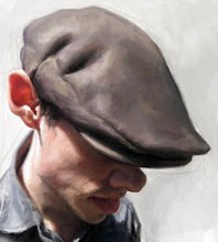
These were taken as reference for folds in clothing and so on. The model wishes to remain anonymous. :)


24 Comments:
It's amazing how many details you put in this picture!
And it's very very funny! Congratulations!
love it love it!! You got so tight in his face... those highlights! i wanna stare at his nose for ages.
It´s always amazing how you create, such strong and originally covers, in such a short period of time. Just stunning.
love it simply love the detail.awesome.......
This is awesome! You're rendering skills are sick!
Ha!!!! Amazing!!!!! This cover turned out really well!!!!
My goodness! This is so friggin awesome. I love how you got the feel of skin and highlights. love the thumbs as well.
Jason,
Your best yet of Obama. Just stunning!!!!!!!!!!
I love this rendering, and the model uhmm sure I have seen him before.
Jason really funny!!!
the composition and the likeness is perfect !!!
fantastic color work !!!
love !!!
GENIAL!!!! WONDERFUL AS ALWAYS!!!
If ever there was s source for inspiration...this is it!! Brilliant eye for detail and colour observation.
Great idea and a great illustration as well
Love all the details and the face of Michelle! :-) Good job!
Dude, that cracked me up...Really good storytelling in your composition.
Still think you have that presidential look Jason. The cover is spectacular - you did burger justice to this piece.. man that looks like a tasty burger!
Rockin!
Amazing job as usual!
wow man, that's incredible!
Yes!!! The burger illo is out and looking awesome! Utne Reader always has the best art and this is no exception.
Another classic from you man!
Awesome bro! Those models you used look familiar for some reason...
Awesome! Thanks for posting the thought process.. Very insightful as always
DOPE!!!!Feelin the sketches and the exaggeration.
Post a Comment
<< Home