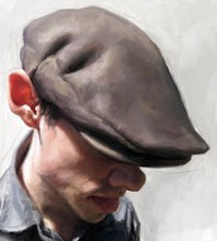
Cory Chisel

I've got a few ideas and projects that I am currently working on. I've been experimenting and working on some new techniques that I think would look great in print, for magazine articles and so on. The full version of the painting is posted below, the above cropped version is how I imagine it might look best in print.
Thank you John Adams for letting me use your photos of Cory for reference.


6 Comments:
Great one sir Seiler.
Love that technique ; I agree, it would be great for prints and all. Cropped version rocks !
amazin!
one of your best
Looks great Jason and I agree on the cropped version. It would look cool in print.
Nice. I hadn't seen it since it was just watercolor. Did you import it into a colored background? Is the lighter yellow/white background behind him done in gouache or digitally? And the white highlights on the face?? White watercolor? Graphic white? other? thanks! But yes, very nice.
Jason, Just a though...It would be great if you could add a "search this blog" widget to your blog so we can search old posts or certain people. Whatcha think?
Post a Comment
<< Home