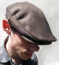
Steve Jobs for Adweek.

Steve Jobs portrait for Adweek.
It was a true honor to be asked to do another portrait for Adweek and even more of an honor that it was to be a tribute for Mr. Steve Jobs. I felt it was important to capture his warmth and passion for life, but to be honest, I felt a fair amount of pressure to say the least. I took this on with the intention of creating something iconic, an image that I hope honors Steve and his family.

This cover was done as a tribute to Steve Jobs, a special three-page gatefold cover. Two illustrations and a photo. The second illustration was done by artist Jorge Colombo, on an iPAD.

Last Wednesday, I was away with my family at an apple orchard of all places. I hadn't heard the news about the passing of Steve Jobs until that night as I drove back to Chicago. My agent called me and told me Adweek wanted me to paint a portrait of Steve. As mentioned above, I was honored to do this painting but felt a great responsibility to get it right. On top of that I had two days to do it. I gathered as much reference for Steve as I could and got to work. I based my image off of two different pictures but noticed subtle things within his expression from other images and brought them all together to create what I hope "feels" like Steve Jobs.

Detail of painting. Even though I did not know Steve personally, he's had such an enormous impact on the world, it felt as if I knew him and it was important to me to not create a sad image, but instead an image that would bring happiness and joy, and hopefully peace to those who knew him. As I painted, I tried to think about his family and what this might be like for them.

Sketches and block in . . . I'd like to thank Nick Mrozowski the art director for thinking of me for another cover, I really appreciate it!
Labels: adweek, Jason Seiler, Portrait, Steve Jobs
posted by SEILER at 9:43 AM
18 comments