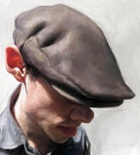
McCain's Choice?


This was a piece I did last week for The Weekly Standard. Had a little more time than usual, had half the day Thursday and a full day on Friday, all in all about 18 hours of work. I would have liked to have put more time into the wheel, but sometimes it's hard to judge my time and what I can and can't finish in that time frame . . . some things take longer than you would think. Anyways, attached is the final as well as a close up of the face to show a bit of the detail, almost has a watercolor feel to it. The others are my very quick sketches as well as a quick mock.
Labels: political caricature, The Weekly Standard


19 Comments:
Jason,
Was told by your DAD to stop by your blog - he just posted your most recent stuff on WetCanvas. Fantastic of course - something to aspire to! You must love it - it shows.
-er, by the way, stop by WetCanvas and say "hi." Your fans miss you.
Beautiful job, Jason! I love his suit!
Man, I love your subtle lighting effects...Yer reflected light is beautiful...Wish I could afford Schoolism...I guess I'm gonna have to figure it out meself!
Dude, this recent stuff is absolutely killer. It's great to see the finished piece of those politicians at the table (Bush is hilarious!)
And thanks a lot for posting that close up of the head in this one. You value/colour skills are unmatched.
Another good one. Those glassy eyes are very disturbing (in a good way).
A couple questions for you:
Are you using Painter or Photoshop these days? What DPI are you working at?
Awesome, That is a great illustration, McCain looks great and you've nailed his expression. I also think that little Mitt head is really great, very strong but so simple. Nice.
Great work Jason - did you draw the wheel in photoshop - or import it from another program?
Thanks so much guys!!! Kyle, I work in photoshop when painting digital, I have the new painter, but it bogs down my whole system, I haven't figured out how to work with it yet? Tim, everything was drawn and painted there in photoshop, no layers were used except multiplying Romney's head and then a layer of noise over everything for texture.
Thanks again!
I THOUGHT you used some noise in there. Really nicely done...most people don't use it well but you certainly did. Great job. I love that you're so willing to share techniques, Jason.
Excellent piece Jason.. top to bottom - then back to the top.. a real powerhouse design/rendering job. The facial detail is not like Chuck Close's work in effect, but your portraiture takes me to the same zone of artistic enjoyment. Where to from here?... Will be nice to find out.. keep 'em coming!
you are a MACHIIIINE ! A new thing all 3 days ago... !! Great !!
So incredible! I love the Hillary pic at the top. & Romney is sooo severely hot!
Thank you so much! Wow, Chuck Close . . . I can dig that!
Hilarious!
It's well done as usual and very impressive for the short time frame you had. I think the wheel looks good- any more developed and it might take the focus away from the McCain face.
Man, you get better every piece you make!
Another great one! McCain's face is absolutely amazing! I also noticed the texture, looks awesome. You are great with the little details like the wet eyes and eyebrows. Nice solid structure too!
Glad to have found your blog, Jason! Hope you come out to Blick some time soon!
The color variations you get in the skin are great. Well done, as always.
Post a Comment
<< Home