The Incredible Shrinking Budget!

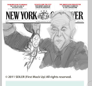
New cover I painted this week. This one was a lot of fun to do, and as usual, these turnarounds are fairly quick. I started sketches and ideas on Friday and the final was due the following Tuesday! I really enjoy doing these covers for the Observer, this is my third cover for them and I hope to do many more!

Close up crop of my final art.

Detail of Bloomie. Because I knew he would be printed quite small on the cover, I didn't bother painting him too large. I always paint larger than the print size . . . but on this one, I decided to keep it fairly loose and simple . . . it's perhaps a bit more cartoony, which I thought was fun to do.

This is my first, very rough thumbnail. This was done in about 5 minutes, just putting down lines quickly, giving birth to the idea . . . it's easier for me to get it out and then develop it more as I go.

The idea begins to form . . .

Still developing the idea and composition . . .

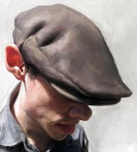
Steps, from initial head sketch to block in of color . . .

Rough head studies . . .
Labels: caricature, Jason Seiler, new york observer


13 Comments:
Amazing work... thank you for sharing your process. Very interesting !
Well done man!
Thanks for breaking it down Jason - a lot to learn and observe. Great cover work!
it's always very cool to see how you get there. Great job, again !
Cheers
Z.
Love it dude! This one is really fun to look at, on top of being expertly painted.
I think even very nice work.
If you have the time would be a pleasure to receive your visit in my blog.
http://diovaneilustracoes.blogspot.com/
Very good, Jason!!
Congratulations!
Brilliant work Jason!!
Your digital painting skills are powerful indeed.
Thanks for sharing, great cover!
Hey Jason, wonderful final piece and also love the way the guy in the background is slightly out of focus! Amazing stuff!
Awesome! Great process.
Titip artikel ya obat sipilis
Post a Comment
<< Home